Clique May

Another Clique event! If you're in San José, go check it out!
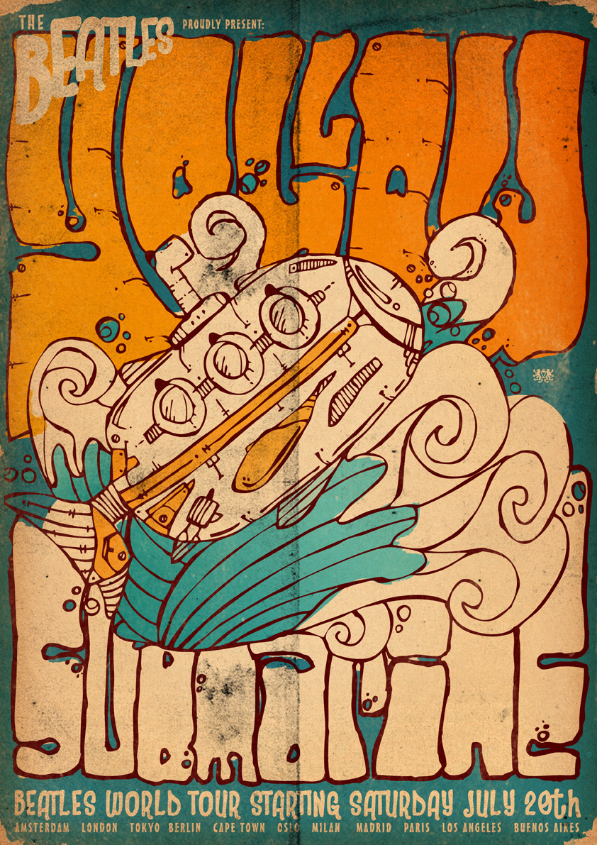
Had some fun with this one in particular. Tried to emulate one of the first designs I ever did that (in my opinion) led up to my usual "style" I have these days.

Another Clique event! If you're in San José, go check it out!
Had some fun with this one in particular. Tried to emulate one of the first designs I ever did that (in my opinion) led up to my usual "style" I have these days.
Beautiful design by Eric Carl. I only just found out about his work, but it's very inspiring. Have a look at his website!
Durign the 60s and 70s some football clubs featured beautiful crests. Some of these crests still survive today, while sadly, others have been replaced.
One example, which is not that famous is from a Portuguese lower division club Academica:
I might dig around and try find some more to make it more interesting.

Another event in San José. Big Bang at B4 Twelve. As always, check it out if you're out there! Bit of a retro comic book superhero/villain look on this one.

Design for the Visual Fixation event at Fahreheit Ultralounge in San José, CA. If you're in the area, check it out!
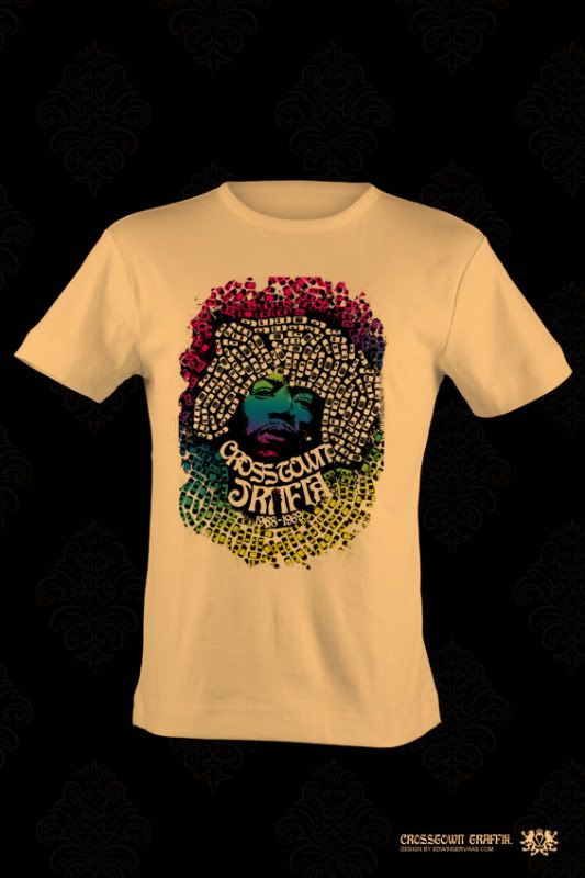
I was doing some research for an upcoming design, and figured I'd share part of that research here. Enjoy, some of my favorite psychedelic designs all found at pooterland.com, some insane color combo's!
Enter the Void is the new movie by Irréversible director Gaspart Noé due to be released sometime 2009. But more importantly is it's stunning movie poster. It's a mix between abstract, neon and classic architecture. Which figures since the movie is set in Tokyo. It's about a Western drug dealer doing his business in Japan. Have a look at the poster below:
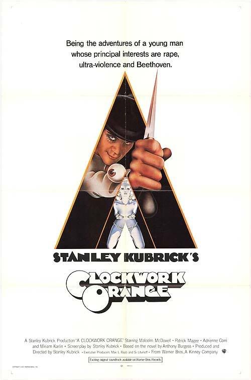
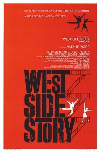
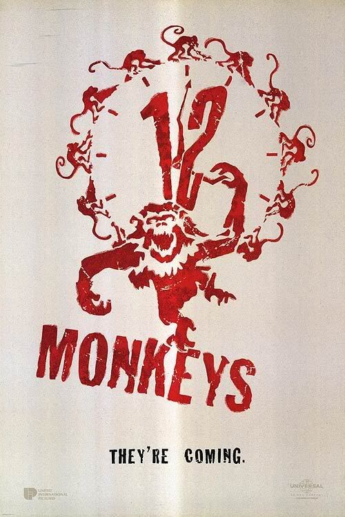
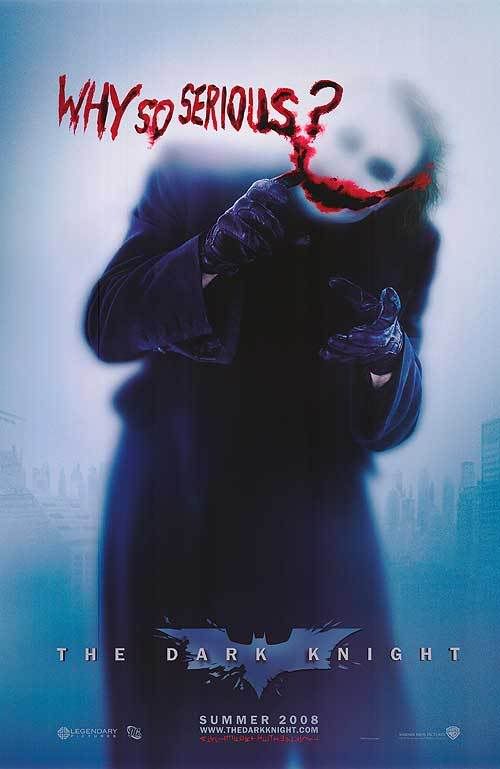
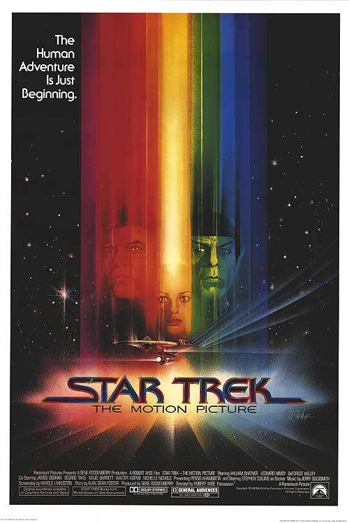
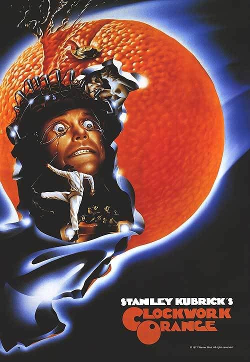
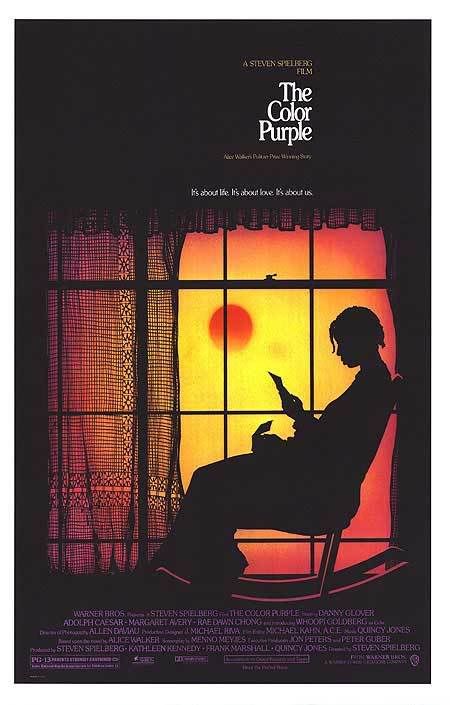
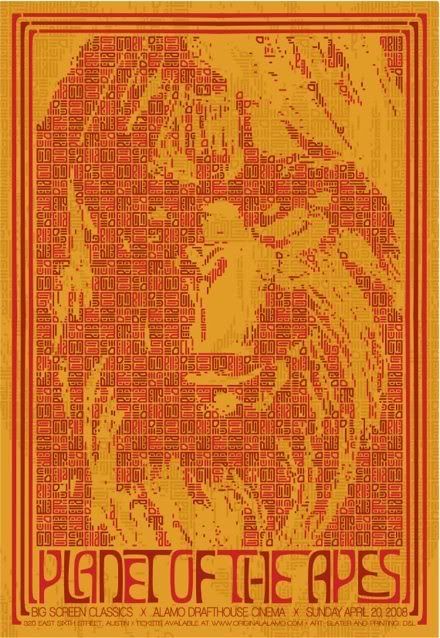
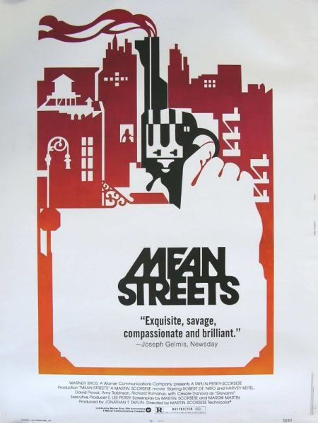
Movieposters are such a fascinating medium to me. They combine two things I love the most, identities and posters. Obviously a movie poster should communicate the content of the movie it represents, but to me it's also important that it does this as to the point as possible. Above are some of my favorite ones.
Ran across the rapid transport map for Moscow. I love how clear, functional and colorful it is. I know these kind of maps can be found in cities all over the world, but I haven't seen one that I wouldn't mind hanging on my wall as much as this one...
Especially dig the great representation of rail that circles the city as an actual circle on the map.
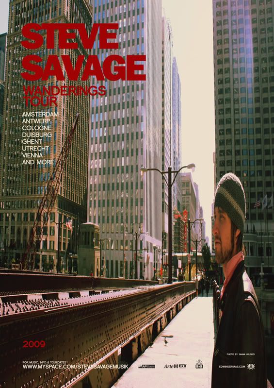
Well, we're in the new year! Yay! Anyways, here's the european tour poster I did for Steve Savage.
Have a look at his myspace and tell me if you think the poster fits with the vibe of his music. You can also check the tour dates there, so if you're in the north-western region of Europe, you know where to go!
I can't resist, must... have... desire... to own... this machine!!
Manufactured by a wonderfully retro company called Derringer Cycles and designed by an industrial designer that goes by the name of Adrian van Anz. It's modeled after racing motorcycles from the 1920's and can do 35 mph, that is 50 km/h. Pretty friggin sweet for getting around the big cities here where a car is no good and public transport is just not as much fun.
If you find yourself in the San Jose / San Francisco area Saturday 18th of October go and check out Clique. It's a bit too far out of the way for me, but would dig to hear how it was!
Ran across an example of some sweet modernist architecture yesterday, Villa Spies built on a small island off the coast of Stockholm, Sweden. "Googie" as the style is named after the first coffeeshop that used this style featured many buildings representing the fast paces car-age times with a desire for the galaxy.
At the time many people expected to be living in space colonies by 2001. "Googie" was prominent in the 40's, 50's and 60's and I suspect Villa Spies to be built in a related futurist style on the haydays of this stream. Although this might have been built in the dying days of this awesome architectural style, I still think this is one of the most beautiful examples of Jetson-esque architecture. The round shapes are made in the phylosophy of creating a house around a person rather than placing a person in the more regular square box homes. I just wish there were more homes designed like this so I could actually look forward to living in a futurist Jetson-esque home one day.
If you want to read more, you might want to check out this awesome book, it's not cheap but I think I'll order it for inspiration sake.
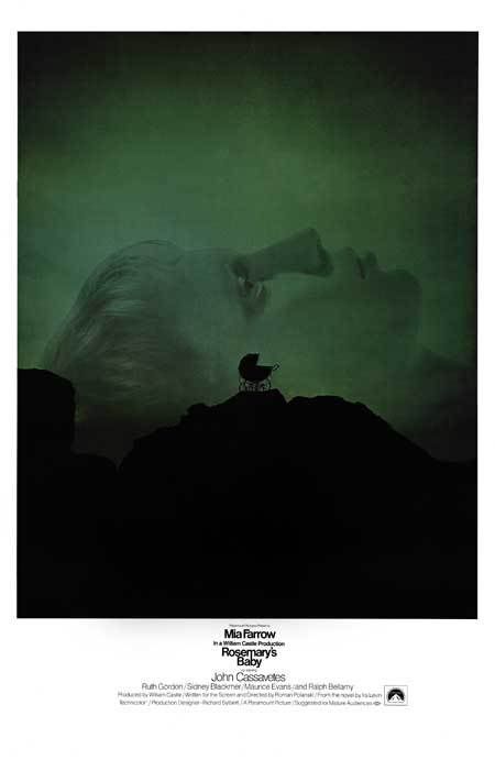
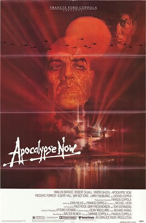
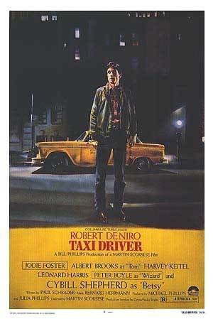
I can't say I saw the movie. We walked out of the sneak preview showing about 2 weeks ago because my girl told me the movie wasn't that great (she saw it overseas already). I'll probably end up seeing it sometime anyways.
But damn, that poster is perfect. It might appear a bit boring to the average public who is used to screamy colorful posters full of explosions, but it is a really good representation of this style of movie posters from the 1970s the time in which this movie plays.
I dig how they placed the photo in the design in such a strong way not being bugged by any text. At the same time they weren't affraid of leaving empty space in the text area where most would have filled up the whole width of the design with the title.
If anyone knows who created this design, please let me know!


